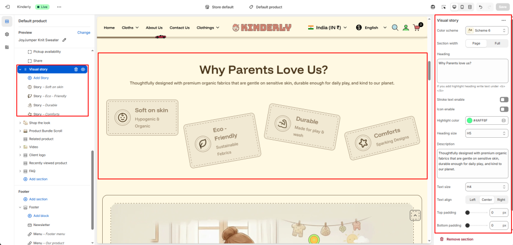
The Visual Story section displays a heading, description, and a set of feature cards arranged in a scattered/rotated card layout — ideal for highlighting product qualities or brand values in a visually engaging way.
Color Scheme #
Choose a predefined color style from your theme’s color options.
Section Width #
Controls the layout width. Options: Page, Full.
Heading #
The main title for the section. Supports highlight text using <b> tag.
Stroke Text Enable #
Toggle to apply a stroke/outline effect on the heading text. (Toggle)
Icon Enable #
Toggle to show a decorative icon next to the heading. (Toggle)
Highlight Color #
Pick the color used for the highlighted part of the heading.
Heading Size #
Select the heading tag size. Options: H1–H6.
Description #
Supporting paragraph text shown below the heading.
Text Size #
Adjusts the font size of the description.
Text Align #
Aligns the heading and description. Options: Left, Center, Right.
Top Padding #
Sets vertical space above the section. Value in pixels.
Bottom Padding #
Sets vertical space below the section. Value in pixels.
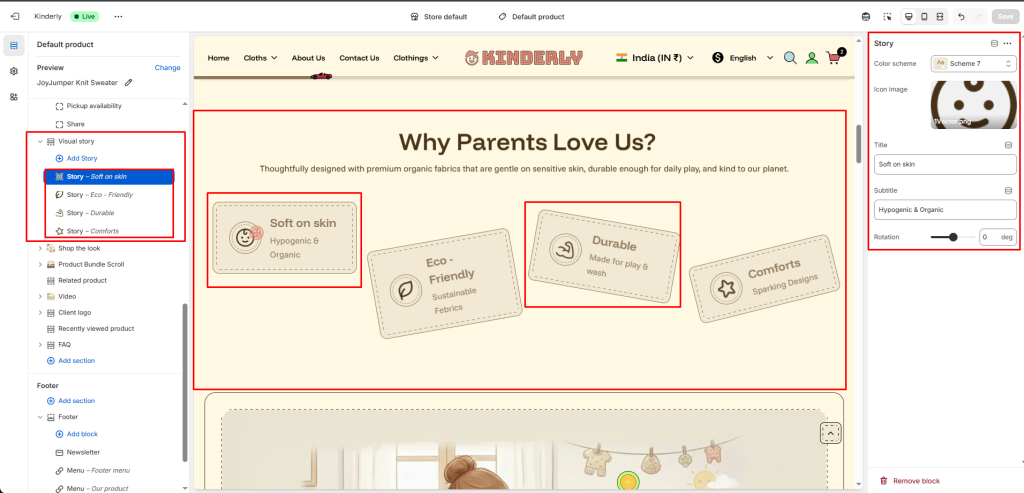
Story Block #
Each block adds one feature card to the scattered layout. Click a block to configure:
Color Scheme #
Choose a color scheme for this individual story card.
Icon Image #
Upload an icon image displayed on the card.
Title #
The main label on the card.
Subtitle #
A short supporting line below the title.
Rotation #
Sets the tilt angle of the card in degrees for the scattered layout effect.