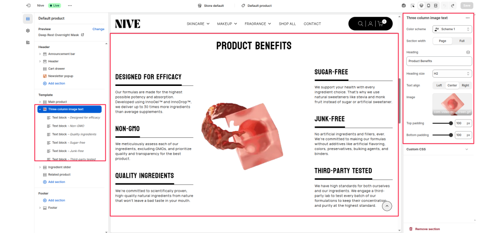
The Three Column Image Text section is designed to display a centered image with supporting text content arranged in two columns (left and right). It is ideal for highlighting product benefits, features, or brand values in a visually balanced layout.
Section Settings #
Color Scheme #
Selects the color theme for the section. Based on theme presets (e.g., Scheme 1, Scheme 2, etc.).
Section Width #
Defines how wide the section appears on the page. Page (standard width) or Full (full-width layout).
Heading #
Specifies the main heading text displayed at the top of the section.
Heading Size #
Select the size of the heading (e.g., H1, H2, H3, H4, H5, H6).
Text Align #
Determines the alignment of the heading. Options: Left, Center, Right.
Image #
Uploads an image or GIF to be displayed in the center between the two text columns. Recommended: Transparent PNG or subtle motion GIF
Top Padding / Bottom Padding #
Adjusts vertical spacing above and below the section.
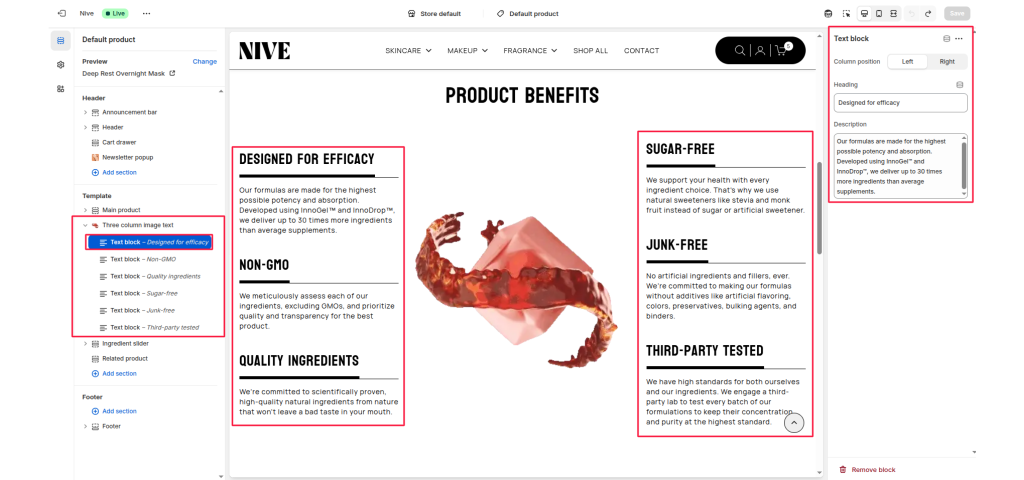
Block Settings #
Each text block represents an individual column content item within the section. You can add multiple text blocks, each with independent content and positioning.
Column Position #
Determines which side of the image the text block will appear on. Left or Right
Heading #
The title or label for the text block.
Description #
The main paragraph or supporting text under the heading.