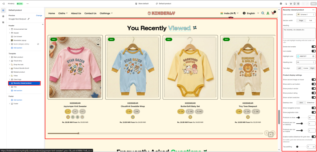
The Recently Viewed Product section automatically displays products the customer has previously viewed, helping them quickly return to items they showed interest in.
Color Scheme #
Choose a predefined color style from your theme’s color options.
Section Width #
Controls the layout width. Options: Page, Full.
Heading #
The main title for the section. Supports highlight text using <b> tag. Default: You recently <b>viewed</b>.
Stroke Text Enable #
Toggle to apply a stroke/outline effect on the heading text. (Toggle)
Icon Enable #
Toggle to show a decorative icon next to the heading. (Toggle)
Highlight Color #
Pick the color used for the highlighted part of the heading.
Heading Size #
Select the heading tag size. Options: H1–H6.
Text Align #
Aligns the heading. Options: Left, Center, Right.
Product Display Settings #
Show Second Image on Hover #
Toggle to display the product’s second image on hover. (Toggle)
Show Add to Cart Button #
Toggle to display an add to cart button on product cards. (Toggle)
Show Product Vendor #
Toggle to show the product vendor name on cards. (Toggle)
Show Product Rating #
Toggle to display the star rating on product cards. (Toggle)
Show Variant Swatches #
Toggle to show color/size variant swatches on product cards. (Toggle)
Desktop View #
Choose how products are displayed on desktop. Options: Grid, Slideshow.
Show Navigation Arrows #
Toggle to display previous/next arrows. (Toggle)
Show Pagination Dots #
Toggle to show dot indicators. (Toggle)
Products to Show #
Total number of recently viewed products to display.
Products per Row on Desktop #
Number of product cards per row on desktop.
Products per Row on Mobile #
Number of product cards per row on mobile.
Enable Mobile Slideshow for Grid View #
Toggle to convert the grid into a horizontal slideshow on mobile. (Toggle)
Top Padding #
Sets vertical space above the section. Value in pixels.
Bottom Padding #
Sets vertical space below the section. Value in pixels.