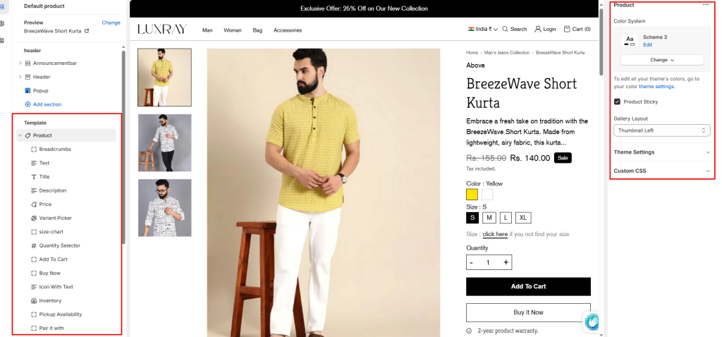
Product templates control the content, layout, and style of your product pages. In the theme editor, you can customize the product media, product overview, and overall page design.
Color System: Select color system for background, text and button color.
Product Sticky: Checked the checkbox for sticky product information.
Gallery Layout: Select media layout here is four layouts option.
- Thumbnail Bottom
- Stacked
- Grid
- Thumbnail Left
Block settings #
It has the following types of blocks:
Title: It displays the selected product’s title inside the Featured product section. It has no customizable block settings available.
Description: It displays a product’s description inside the Featured product section. It has no customizable block settings available.
Price: It displays a product’s price inside the Featured product section. It has block settings available to enable/desable for Tax Enable.
Quantity Selector: It displays a quantity selector, inside the featured product section, for choosing the number of products to purchase. It has no customizable block settings available.
Variant Picker: Displays a variant picker for selecting variants of a product inside the Featured product section. It has no customizable block settings available.
Please refer to Theme settings > Product for the different variants styles (Dropdown and Color swatches).
Add to Cart: It shows the Add to cart buttons in the Featured product section.
Buy Now: It shows the Buy now buttons in the Featured product section.
Text: Enter any additional text to display in this featured product section. To display dynamic data, like product Title or Vendor, select the Insert dynamic source icon shown next to the Text box and select any metafield to add here. for more understanding, refer to Metafields.
Inventory: It displays the product’s Inventory.

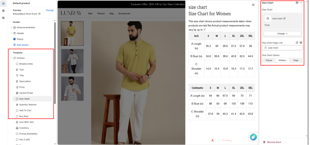
Size Chart: Select page for size chart.
- Size Chart Page Link: Add Size Chart page link.
- Size Chart Option: Choose any 1 option for size chart show here is three option popup, sidebar and page.
Breadcrumbs: Display links that show customers where they are on your site.
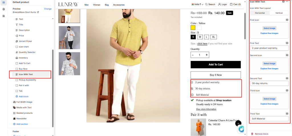
Icon With Text: Here is 3 icon with text block in a one block.
- Icon With Text Layout: Choose any one layout for show this block. here is two option horizontal and vertical.
- First Icon/Second Icon/Third Icon: Select any image to show in place of icon. This has more priority than the icon.
- First Text/Second Text/Third Icon: Enter any text to show below the icon.
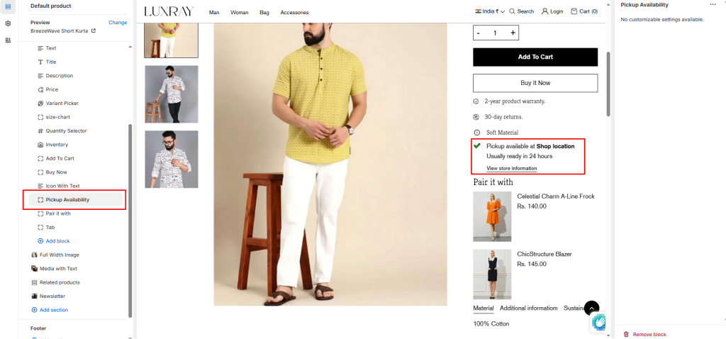
Pickup Availability: Making your shopping even easier! Now, you can choose the pickup option for your orders.
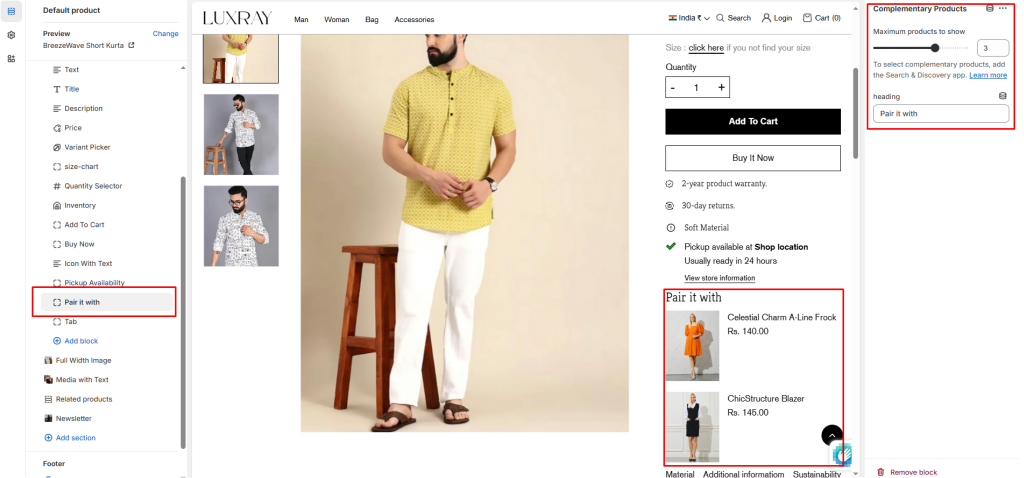
Complementary Products: To select complementary products, add the Search & Discovery app. Learn more
- Maximum products to show: Choose how many products show. The minimum number is 1 products and the maximum is 4.
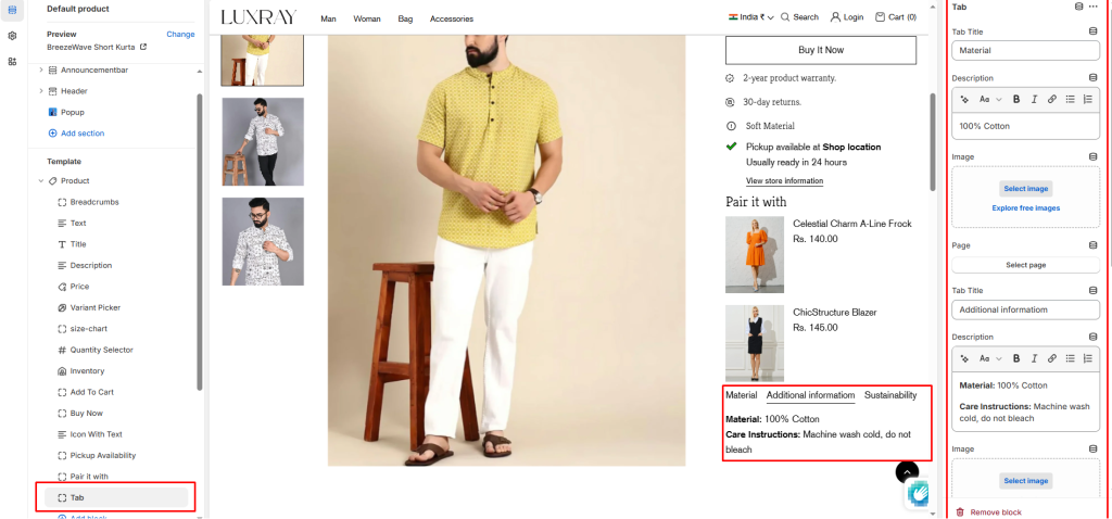
Tabs: Each Product tab includes custom headings and text, optional Page content (eg. for a size guide), and block image.
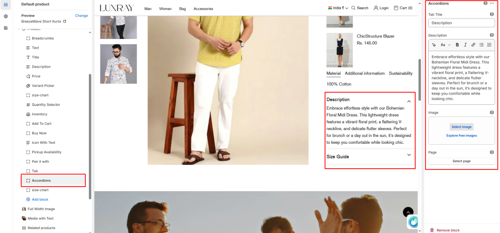
Accordions: This block to include a Heading, Description, Link, and Page content in an interactive container.