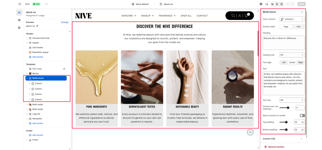
The Multicolumn section is designed to display a series of content blocks (columns) side-by-side.
It’s ideal for showcasing features, values, benefits, or services — for example, highlighting brand qualities, product advantages, or key information in a visually organized layout.
Each column supports an image, title, text, and optional link, giving merchants flexible control over how content is presented.
Section Settings #
Color scheme #
Select a color scheme to match your theme’s style and improve contrast for readability.
Section width #
Choose how wide the section should appear:
- Page: Keeps content within the main page container.
- Full: Extends content edge-to-edge across the browser window.
Heading #
The main title displayed above the columns.
Heading size #
Choose the heading’s text style (H2, H3, H4, etc.) based on the visual hierarchy of the page.
Text align #
Set the alignment for the section heading and description:
- Left
- Center
- Right
Text #
Add an introductory paragraph or supporting description beneath the heading.
Text size #
Adjust the font size for the section’s description to match the visual design.
Columns per row (desktop) #
Define how many columns appear side-by-side on desktop screens.
Common options: 2–4 columns per row.
Stack columns on mobile #
Enable this option to stack columns vertically on smaller devices for better readability and spacing.
Top padding / Bottom padding #
Control vertical spacing above and below the section. Useful for maintaining consistent layout flow.
Blocks (Columns):
Each Column block represents one content card inside the multicolumn layout.
Multiple columns can be added to form rows of equal-height, balanced items.
Available Block: Column #
Each Column block contains the following options:
Image #
Upload an image to represent the column visually.
Ideal for product shots, icons, or feature illustrations.
Heading #
The title or label for the column content.
Text #
Add a short description or supporting information beneath the heading.
Link (optional) #
Add a button or make the image clickable by linking to another page, product, or collection.