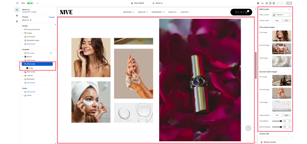
The Multi Media section is a flexible image layout section that allows you to showcase multiple images in a two-column grid format — ideal for highlighting brand visuals, lifestyle photography, or product imagery in an editorial-style presentation.
Section Settings #
Color scheme #
Choose a background and text color combination that matches the overall page design or provides contrast to your images.
Section width #
Adjust how the section spans across the page:
- Page: Keeps content aligned within the main container width.
- Full: Stretches the section edge-to-edge for a full-bleed layout effect.
First column images #
Upload up to three images that will appear in the first (left) column. These images stack vertically and usually feature smaller, detail-oriented visuals.
Second column images #
Upload up to three images for the second (right) column. These can be complementary visuals, alternate angles, or supporting product shots.
- First image – Top image in the right column.
- Second image – Middle image in the right column.
- Third image – Bottom image in the right column.
Image position #
Determines which side the main large image appears on when paired with smaller image sets.
- Left: Displays the large image on the left side of the section.
- Right: Displays the large image on the right side of the section.
Top padding / Bottom padding #
Add spacing above and below the section to maintain visual balance with neighboring sections.
Block Settings #
Each block includes flexible options for customization:
- Image
- Text
- Columns