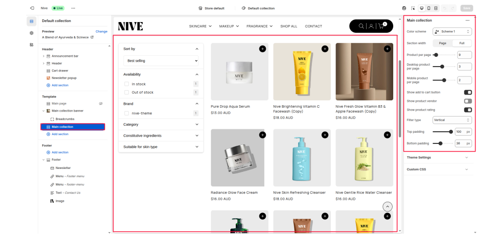
The Main Collection section displays a collection of products on the collection page. It supports product filtering, sorting, grid configuration, and adjustable layouts for both desktop and mobile. The section adapts to your theme’s design using the selected color scheme and padding options.
Section Settings #
Color scheme #
Selects the color style (e.g., Scheme 1, Scheme 2) applied to the section background and text to match the overall theme.
Section width #
Controls how wide the section appears on the page.
- Page: Uses the standard content width.
- Full: Extends the collection layout to full browser width.
Product per page #
Defines how many products to load per page before pagination or infinite scroll appears (example: 9).
Desktop product per page #
Sets how many products appear per row on desktop view.
Mobile product per page #
Sets how many products appear per row on mobile view.
Show add to cart button #
Toggle ON/OFF to display or hide the “Add to Cart” button below each product.
Show product vendor #
Toggle ON/OFF to show or hide the product vendor name under product titles.
Show product rating #
Toggle ON/OFF to display the product star rating (if available).
Filter type #
Controls how the filters appear on the collection page.
- Vertical: Filters are displayed on the left side of the products grid.
- Horizontal: Filters are displayed in a horizontal layout above the grid.
Top padding #
Adds vertical spacing at the top of the section.
Bottom padding #
Adds vertical spacing at the bottom of the section.