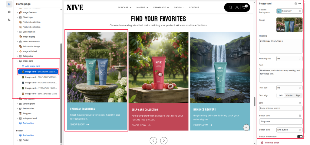
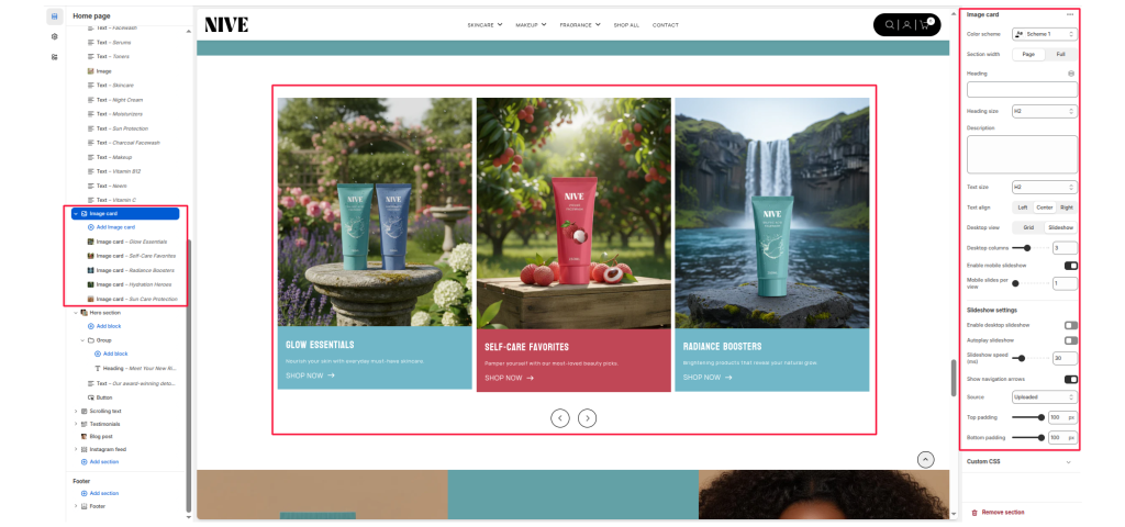
The Image Card section allows merchants to showcase multiple promotional image blocks in either a grid layout or a slideshow layout. Each card can display an image, title, description, and call-to-action button. This section is ideal for highlighting featured categories, collections, or brand stories.
Color Scheme #
Controls the overall background and text color of the section using theme color presets.
Section Width #
Choose whether the content is contained within Page width or spans Full width.
Heading #
Main heading for the section (example: “FIND YOUR FAVORITES”).
Heading Size #
Select the visual size of the heading (H1–H6).
Description #
Optional text that appears under the heading.
Text Size #
Controls the size of the description text (H1–H6).
Text Align #
Align the heading and description to Left, Center, or Right.
Layout Settings #
Desktop View #
Choose between two display modes for desktop:
- Grid – displays cards in multiple columns
- Slideshow – displays image cards in a swipeable slider
Desktop Columns #
Select how many cards to show per row in grid mode (example: 2, 3, 4).
Enable Mobile Slideshow #
Enable or disable slideshow mode on mobile even when desktop uses grid layout.
Mobile Slides Per View #
Set how many slides appear at once in mobile slideshow mode.
Slideshow Settings #
Enable Desktop Slideshow #
Activates slideshow mode on desktop.
Autoplay Slideshow #
Automatically cycles through slides.
Slideshow Speed #
Slide transition interval (in milliseconds).
Show Navigation Arrows #
Display left and right arrows for manual slide navigation.
Source #
Choose External URL to embed YouTube or Vimeo videos or Image.
Top Padding #
Adjusts the top spacing of the section.
Bottom Padding #
Adjusts the bottom spacing of the section.
Block Settings #
Each block represents one card inside the section.
Column Background #
Choose a color scheme for the bottom text area of the card.
Image #
Upload or select the main image for the card.
Heading #
Title shown below the image (example: “EVERYDAY ESSENTIALS”).
Heading Size #
Select heading size (H1–H6).
Text #
A short description supporting the heading.
Text Size #
Controls the size of the card’s description text.
Text Align #
Align card text to Left, Center, or Right.
Link #
Attach a link to collections, pages, or products.
Button Label #
Set the CTA button text (example: “SHOP NOW”).
Button Style #
Select the style of the button (e.g., Link button, Solid button).
Button Icon Enable #
Enable or disable an arrow icon inside the button.