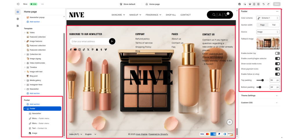
The Footer Section appears at the bottom of your Shopify theme and is divided into multiple customizable blocks. It supports a background image, color scheme, newsletter subscription, multiple menus, contact information, and an image logo.
Color scheme #
Choose the color scheme that matches your site design. This affects text and button colors over the video.
Section width #
Choose how wide the section appears on the page:
- Full – expands the video to full browser width.
- Page – keeps the video within page content width.
Source #
Choose the background source: image, video, none.
Typically used for setting a background image.
Fallback image #
Upload an image used as a background when “image” is selected as the source.
Enable border top #
Adds a thin line across the top of the footer for separation from the main page.
Enable country/region selector #
Displays a dropdown menu for choosing country or region.
Show social media icons #
Toggles visibility of your social media icons (Facebook, Instagram, etc.).
Show payment icons #
Shows payment method icons (Visa, PayPal, etc.) supported by your store.
Enable follow on shop #
Adds a “Follow on Shop” option.
Top padding #
Controls the spacing above the footer content.
Bottom padding #
Controls the spacing below the footer content.
Blocks Section #
1. Newsletter Block #
Used for adding a newsletter signup form.
Settings #
- Newsletter title: Text heading above the email input field. Example: “Subscribe to our newsletter.”
- Newsletter text: Optional description below the title.
- Social link title: Text heading shown before social media icons.
Features #
- Includes an email input field.
- Uses Shopify’s built-in newsletter form.
- Displays social media icons if enabled in section settings.
2. Menu Block #
Displays a navigation menu with links.
Settings #
- Menu: Select an existing Shopify navigation menu.
- Show menu title: Enable or disable the menu title.
- Menu title: Custom title text for the menu. Example: “Company,” “Help,” or “Pages.”
Features #
- Displays a vertical list of links.
- Commonly used for policy, about, or informational links.
3. Text Block (Contact Information) #
Used to display plain or rich text such as contact details, address, or business hours.
Settings #
- Heading: Title of the block (e.g., “Contact Us”).
- Heading size: Choose the heading size (H1 to H6).
- Text: Rich text area for content like address, email, or phone number.
- Text size: Choose text size (
h5orh6).
Features #
- Supports clickable links (like mailto or tel).
- Used for showing static business info.
4. Image Block (Logo) #
Used to display a logo or brand image in the footer.
Settings #
- Image: Upload a logo image.
- Image width: Adjust how wide the image appears (10% – 100%).
- Link: Optional link that makes the image clickable (e.g., to homepage).
Features #
- Typically used for brand or certification logos.
- Image scales responsively.


