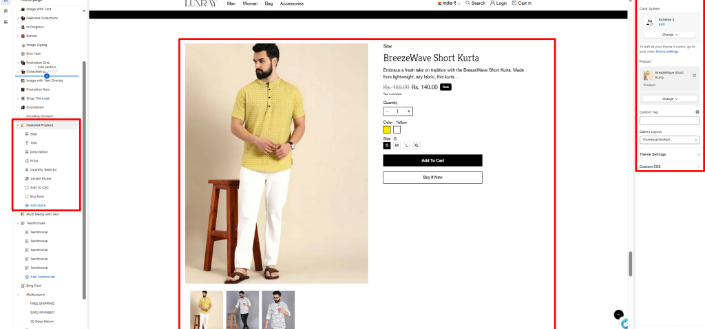
The Featured product section displays an entire product form on your page so customers can buy your products on the spot.
Color System: Select color system for background, text and button color.
Product: Select any product to showcase in the featured product section. This product can be changed/removed at any time using the change button.
Custom Tag: It displays the selected product inside the Featured product section.
Gallery Layout: Select media layout here is four layouts.
- Stacked
- Grid
- Thumbnail Left
- Thumbnail Bottom
Block settings #
It has the following types of blocks:
Title: It displays the selected product’s title inside the Featured product section. It has no customizable block settings available.
Description: It displays a product’s description inside the Featured product section. It has no customizable block settings available.
Price: It displays a product’s price inside the Featured product section. It has block settings available to enable/desable for Tax Enable.
Quantity Selector: It displays a quantity selector, inside the featured product section, for choosing the number of products to purchase. It has no customizable block settings available.
Variant Picker: Displays a variant picker for selecting variants of a product inside the Featured product section. It has no customizable block settings available.
Please refer to Theme settings > Product for the different variants styles (Dropdown and Color swatches).
Add to Cart: It shows the Add to cart buttons in the Featured product section.
Buy Now: It shows the Buy now buttons in the Featured product section.
Text: Enter any additional text to display in this featured product section. To display dynamic data, like product Title or Vendor, select the Insert dynamic source icon shown next to the Text box and select any metafield to add here. for more understanding, refer to Metafields.
Size Chart: Select page for size chart.
Inventory: It displays the product’s Inventory.