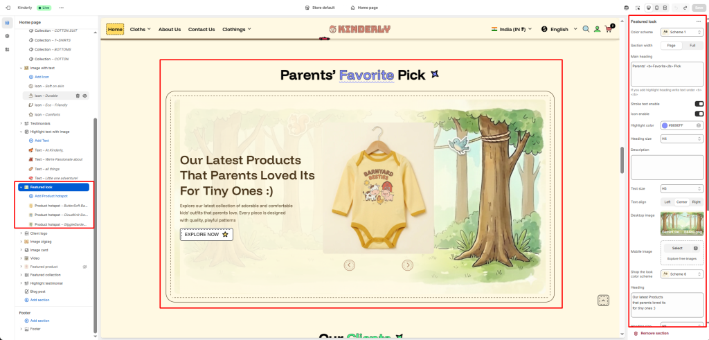
The Featured Look section displays a lifestyle image with product hotspots alongside a content panel — combining storytelling with interactive product discovery.
Color Scheme #
Choose a predefined color style from your theme’s color options.
Section Width #
Controls the layout width. Options: Page, Full.
Main Heading #
The main title displayed above the section. Supports highlight text using <b> tag.
Stroke Text Enable #
Toggle to apply a stroke/outline effect on the heading. (Toggle)
Icon Enable #
Toggle to show a decorative icon next to the heading. (Toggle)
Highlight Color #
Pick the color used for the highlighted part of the heading.
Heading Size #
Select the heading tag size. Options: H1–H6.
Description #
Optional supporting text shown below the main heading.
Text Size #
Adjusts the font size of the description.
Text Align #
Aligns the heading and description. Options: Left, Center, Right.
Image Settings #
Desktop Image #
Upload the lifestyle image displayed on desktop.
Mobile Image #
Upload a separate image optimized for mobile.
Shop the Look Color Scheme #
Choose a color scheme for the hotspot popup card.
Heading #
The title shown in the left content panel.
Heading Size #
Select the heading tag size for the content panel.
Product Hotspot Block #
Each block places one product hotspot on the image. Clicking a hotspot reveals a product card popup. Add blocks via + Add Product Hotspot.