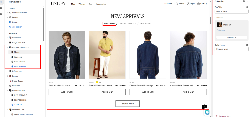
Featured collection allows you to highlight a specific collection of products on your store pages. This section generates a grid of products in any page.
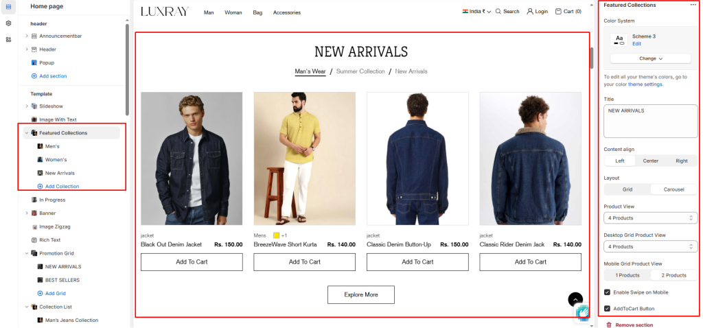
Color System: Select color system for background, text and button color.
Title: Enter text to display as a title on the featured collection.
Content align: Change text position left, center and right.
Layout: Choose the layout that best suits your page’s design. There are two different modes to choose from for your store Grid/ Carousel.
Product View: The maximum number of products per tab.
Desktop Grid Product View: Adjust the Products per row slider/grid to specify the number of products to display within each row inside the section. The minimum number is 2 products and the maximum is 5. This setting applies to desktop display devices.
Mobile Grid Product View: Use the Products per row on mobile radio buttons to specify the number of products to display in each row inside the section. The options are 1 and 2. This setting applies to mobile display devices.
Enable Swipe on Mobile: Select/deselect to enable the Swipe on Mobile.
Add to Cart Button: Select/deselect to show the Add to Cart Button on product card.
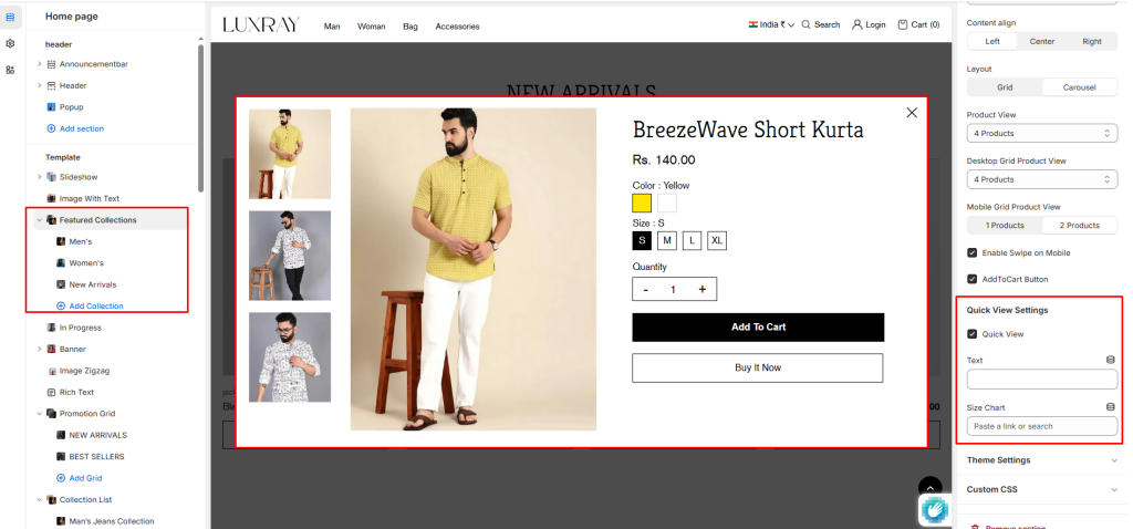
Quick View Settings #
Quick View: Select the Enable quick view checkbox to show/hide a “Choose options” button on product tiles inside the section. A store visitor uses the button to choose product options, like variants, to add to their cart. To use this option with popup.
Text: Show custom text om quick view popup.
Size Chart: Select page for size chart.
Blocks #
Tab Title: Select multiple blocks to show tabs and write tab title otherwise showing collection name.
Collection: Select collection to show selected collection’s products.
Button Label: Add button label to redirect to collection page.