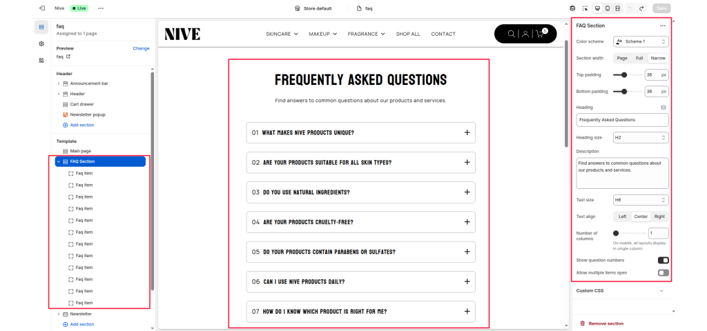
The FAQ Section allows you to display a list of frequently asked questions in an accordion layout. Each FAQ item can expand or collapse to show the answer, helping users find key information quickly. This section is great for support, product details, or brand information.
Section Settings #
Color scheme #
Select a predefined color style to match your theme’s design.
Section width #
Choose how wide the section appears on the page. Options: Page, Full, or Narrow.
Top padding #
Adds space above the section content (in pixels).
Bottom padding #
Adds space below the section content (in pixels).
Heading #
The main section title. Example: “Frequently Asked Questions.”
Heading size #
Controls the heading level (H1–H6). Example: H2 for standard page titles.
Description #
A short paragraph shown below the heading. Example:
“Find answers to common questions about our products and services.”
Text size #
Adjusts the size of the description text (e.g., H6, small, medium).
Text align #
Aligns section text to Left, Center, or Right.
Number of columns #
Defines how many columns the FAQ items display in (usually 1).
Note: On mobile devices, all layouts display as a single column.
Show question numbers #
Toggle ON to display numbered questions (e.g., 01, 02, 03…).
Allow multiple items open #
When enabled, users can open more than one question at the same time.
Blocks Settings #
FAQ Item #
Each block represents a single question and answer.
Question #
The question text displayed in the accordion title.
Example: “What makes NIVE products unique?”
Answer #
The text shown when the accordion expands.
Example: “NIVE products are formulated with a balance of natural and scientifically proven ingredients.”
You can add multiple FAQ Item blocks to create a full list of FAQs.