This page will automatically list all the current collections in your store.
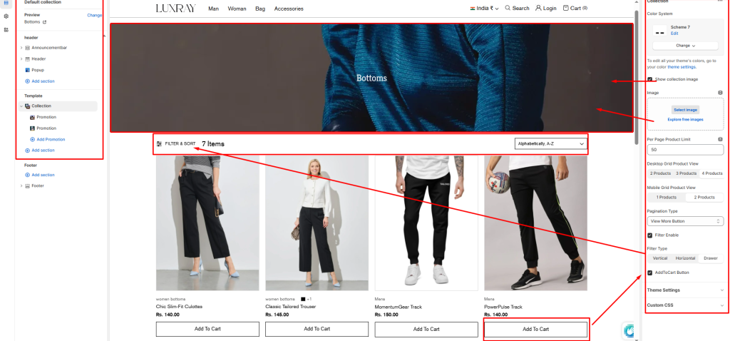
Color System: Select color system for background, text and button color.
Show collection image: Select/deselect to show/hide the collection image as a banner.
Image: Select image to show as a banner.
Per Page Product Limit: Set product limit for pagination.
Desktop Grid Product View: Adjust the Products per row slider/grid to specify the number of products to display within each row inside the section. The minimum number is 2 products and the maximum is 5. This setting applies to desktop display devices.
Mobile Grid Product View: Use the Products per row on mobile radio buttons to specify the number of products to display in each row inside the section. The options are 1 and 2. This setting applies to mobile display devices.
Pagination Type: Choose from paginated, view more button or infinite scrolling here.
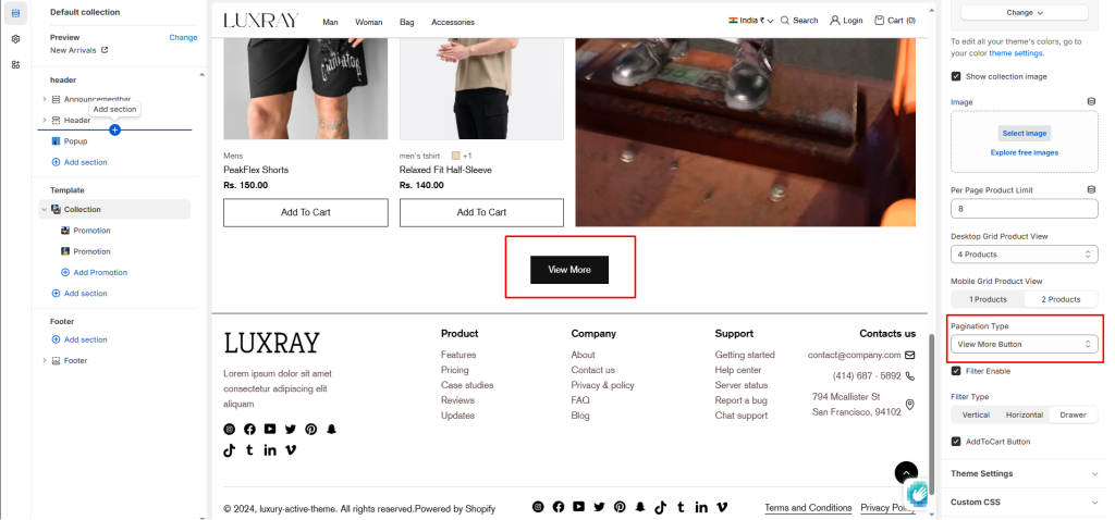
Filter Enable: Select/deselect to show/hide the filter.
Filter Type: Select filters type vertical, horizontal and drawer.
Add to Cart Button: Select/deselect to show the Add to Cart Button on product card.
Block settings #
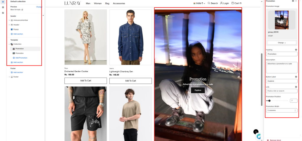
You can add a promo block to your collection pages section.
Promotion Image: Add image to show image in blocks.
Heading: Enter text to display as a heading on the image.
Description: In the text box, enter body text to display on image.
Button label: Filling this in will display a button under the image.
Button link: Select links or collections/product for button.
Promotion Position: Set number to set promotion block position.
Promotion Width: Choose option to set width 1 column, 2 column, 3 column and 4 column.