The Categories section allows merchants to showcase product categories or collections in a visually engaging, tag-style layout with optional images. This section is ideal for highlighting skincare, beauty, fashion, or any grouped product categories on the homepage.
Section Overview #
This section allows merchants to display a group of product categories using text labels or images. It includes a heading, description text, and flexible category blocks that automatically wrap in rows.
Section Settings #
Color Scheme #
Controls the background and text color using any theme color preset.
Categories Color Scheme #
Applies a separate color scheme specifically to the category items (chips/buttons).
Section Width #
Choose between Page width or Full width layout.
Heading #
Main section title such as “EXPLORE OUR COLLECTIONS”.
Heading Size #
Select the size for the heading (H1–H6).
Text #
Optional description displayed below the heading.
Text Size #
Controls the size of the description text (H1–H6).
Text Alignment #
Align text to Left, Center, or Right.
Top Padding #
Adjusts spacing above the section.
Bottom Padding #
Adjusts spacing below the section.
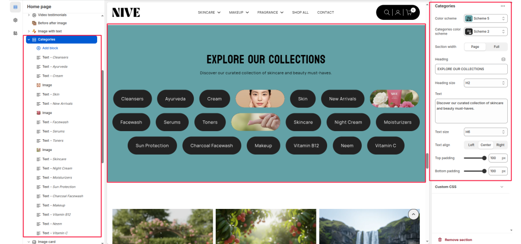
Table of Contents #
- Home
- Helpdesk
- Nive
- nive sections
- Banner
Banner #
Table of Contents
The Banner section is a visually impactful area designed to display a large background image (or video) with optional text overlay content. It’s commonly used on landing pages such as About Us, Collections, or Home, to introduce the page with strong visuals and key messaging.
This section supports responsive design with separate desktop and mobile image uploads, and flexible layout options for aligning text and call-to-action elements.
Section Settings #
Color scheme #
Choose a predefined color scheme to match the section’s text and overlay elements with the rest of the theme design.
Section width #
Control how wide the banner appears:
- Page: Keeps the banner within the page container width.
- Full: Spans edge-to-edge across the browser window for a full-width banner experience.
Desktop image #
Upload a high-quality banner image optimized for larger screens.
Mobile image #
Optionally upload a separate image optimized for mobile devices to ensure visual clarity and proper scaling.
Overlay opacity #
Adjust the dark overlay transparency on top of the banner image. This helps improve text readability and contrast.
Direction #
Choose how the content (title, text, buttons) is arranged.
- Vertical: Stacks elements top to bottom.
- Horizontal: Places elements side-by-side (ideal for wide banners).
Desktop content position #
Defines where the overlay content is positioned within the banner. Options typically include:
Top padding / Bottom padding #
Add vertical spacing above and below the banner content for better layout balance.
Section Blocks #
Text Block #
A simple text-based category item.
- Title: The category name (e.g., Cleaners, Ayurveda).
- Link: Optional link to a collection or page.
Image Block #
A category item displayed with an image.
- Image: The image that represents the category.
- Link: Optional link to a category or page.


