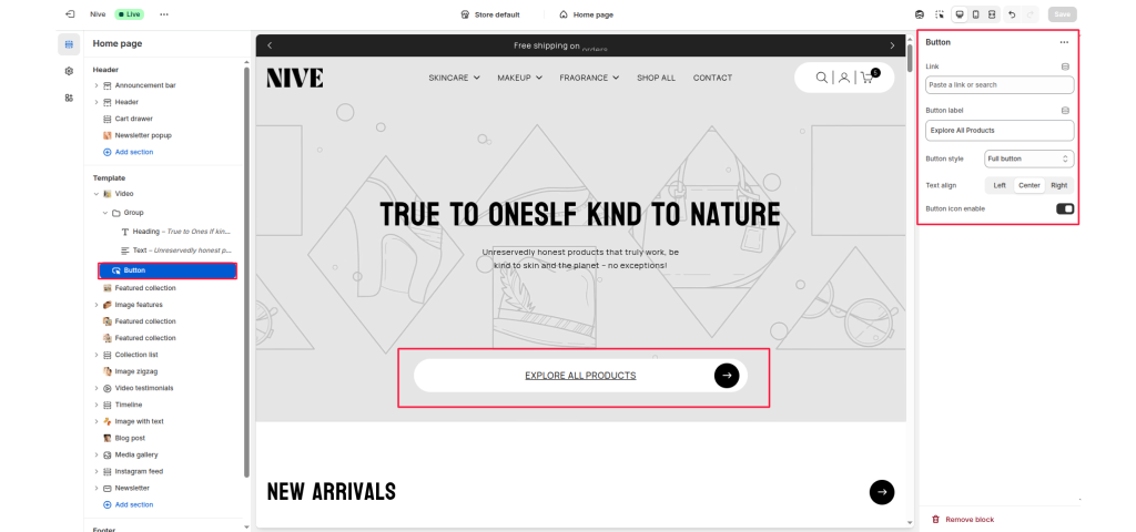
The Button Block adds a customizable call-to-action (CTA) button inside a section or group of blocks.
It allows merchants to link to any page, collection, or product, with adjustable label text, alignment, style, and optional icon display.
This block is commonly used in hero sections, featured content, image banners, and promotional sections to direct customers toward important areas of the store.
Link #
Select or paste a link to a product, collection, or page. Determines where the button redirects when clicked.
Button label #
The visible text displayed on the button. Example: “Explore All Products” or “Shop Now”.
Button style #
Choose between available button styles. The styles depend on your theme’s design system.
- Primary button
- Secondary button
- Full button
- Link button
- Button with icon
Text align #
Sets horizontal alignment of the button — options: Left, Center, Right.
Button icon enable #
Toggles an icon (e.g., arrow or play symbol) on or off next to the button text.