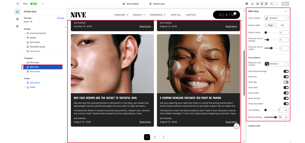
The Main Blog section displays your store’s blog posts in a customizable grid layout. It allows you to showcase featured images, titles, excerpts, author names, and post dates. The layout is responsive and supports pagination for browsing multiple posts.
Section Settings #
Color scheme #
Selects the background and text color combination for the overall section.
Section width #
Determines how wide the blog section appears:
- Full: Makes the section span edge-to-edge across the screen.
- Page: Keeps the layout within the standard site container width.
Posts to show #
Controls how many blog posts are shown per page.
Posts per row on desktop #
Sets how many posts appear in one row on desktop devices.
Posts per row on mobile #
Sets how many posts are displayed per row on mobile devices.
Post Options #
Blog post color scheme #
Allows selecting a color scheme specifically for blog post cards (can differ from the main section scheme).
Show featured image #
Toggles whether to display the blog post’s featured image.
Show title #
Enables or hides the blog post title.
Show tag #
Displays the tag associated with each post (if available).
Show date #
Shows the publication date of each blog post.
Show author #
Displays the blog post author name.
Show excerpt #
Shows the beginning portion of the blog post content (short summary or first few lines).
Show description #
Displays the full blog post description (if you prefer showing more text than just the excerpt).
Top padding #
Adds vertical spacing at the top of the section.
Bottom padding #
Adds vertical spacing at the bottom of the section.