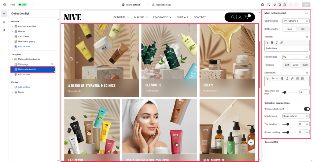
The Main Collection List section displays multiple collections in a grid layout. It’s typically used on the “Collection List” page to showcase different product groups. Each collection card can show its title, featured image, and optional product count. The section supports adjustable layout, color scheme, and spacing to fit your theme design.
Section Settings #
Color scheme #
Selects the background and text color style applied to the section (e.g., Scheme 1, Scheme 2). This ensures visual consistency with your overall theme.
Section width #
Controls how wide the section appears on the page:
- Page: Keeps the content within the page’s standard container width.
- Full: Extends the section edge-to-edge across the screen.
Heading #
Adds a customizable heading at the top of the section (example: “Collections”).
Heading size #
Sets the visual hierarchy of the heading text (e.g., H1, H2, H3, H4, H5, H6).
Text align #
Aligns the heading and description text to the Left, Center, or Right.
Description #
Optional text area to provide a short introduction or context about the collections displayed in this section.
Collections per page #
Defines how many collection cards to display in a single view.
Collection Card Settings #
Show product count #
Toggles whether to display the total number of products within each collection (e.g., “9 products”).
Mobile layout #
Controls how collection cards appear on mobile screens:
- Single column: Displays one collection card per row (large visual focus).
- Double column: Displays two smaller collection cards per row (more compact view).
Top padding #
Adds vertical spacing at the top of the section.
Bottom padding #
Adds vertical spacing at the bottom of the section.