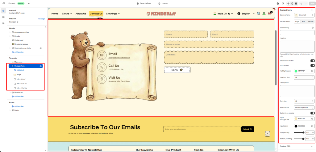
The Contact form section allows customers to reach out directly through your website. It includes customizable text content, contact fields, and optional image and info blocks for better presentation.
Section Settings #
Color scheme #
Choose a predefined color style from your theme’s color options.
Section width #
Controls the section layout width. Options: Page, Full, or Narrow.
Subheading #
A short text shown above the main heading, usually a small introduction like “Get in Touch.”
Heading #
The main title for the section, such as “Let’s Chat, Reach Out to Us.”
Heading size #
Selects the heading level (H1–H6). Use H2 or H3 for balance in design.
Description #
Add a supporting paragraph under the heading. Example: “Have questions or feedback? We’re here to help. Send us a message, and we’ll respond within 24 hours.”
Text size #
Adjusts the font size of the description text.
Button style #
Lets you select a predefined button style.
Top padding #
Adds vertical space above the section content. Value in pixels.
Bottom padding #
Adds vertical space below the section content. Value in pixels.
Blocks Settings #
Image block #
Displays an image beside the contact form, typically on the right side. Useful for adding a brand or lifestyle image.
Info – Email block #
Adds an email contact detail with an icon.
Info – Phone block #
Adds a phone number with an icon.