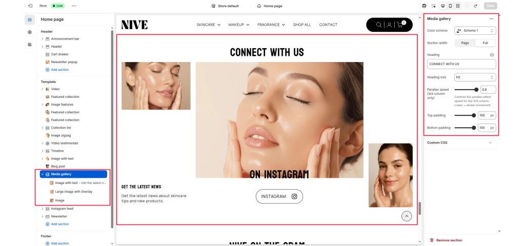
The Media Gallery section is designed to display a collection of images or media content in a visually dynamic grid layout. It’s ideal for showcasing lifestyle photography, brand highlights, product moments, or social media content — helping to create a more immersive storytelling experience.
Section Settings #
Color scheme #
Select a predefined color palette that fits your theme’s visual identity.
Section width #
Choose between Page (contained layout) or Full (edge-to-edge layout).
Heading #
Add a section title to introduce your gallery.
Heading size #
Choose the size of your heading (H1–H6) to control visual hierarchy.
Parallax speed (3rd column only) #
Adjust the parallax scrolling speed for the third column image. Lower values result in slower, more subtle motion effects.
Top padding / Bottom padding #
Control the vertical spacing above and below the section to create balanced spacing with adjacent content.
Blocks Settings #
The Media Gallery section supports multiple block types, allowing flexibility in media presentation.
Image with text #
- Displays an image alongside short descriptive text and optional link or button.
- Ideal for announcing updates or promotions.
Large image with overlay #
- Features a large visual with text overlay support.
- Great for impactful storytelling or feature highlights.
Image #
- Displays a simple image without additional text or link.
- Useful for filler visuals or purely aesthetic gallery elements.