The Collection List section allows merchants to display multiple collections in a visually engaging slider or grid layout. Each collection can feature a custom image, title, and link. Ideal for highlighting product categories or featured groups.
Section Settings #
Color scheme #
Choose the desired color palette for this section from the available theme schemes.
Section width #
Choose how wide the section spans on the page:
- Page: Aligns section content with the page container.
- Full: Stretches the section edge-to-edge across the browser window.
Section Heading #
The main title for the section. Supports highlight text using <b> tag. Default: Shop from <b>collections</b>.
Stroke Text Enable #
Toggle to apply a stroke/outline effect on the heading text. (Toggle)
Icon Enable #
Toggle to show a decorative icon next to the heading. (Toggle)
Highlight Color #
Pick the color used for the highlighted part of the heading. Default: #FFCC00.
Heading Size #
Select the heading tag size. Options: H1–H6. Default: H4.
Text Align #
Aligns the heading. Options: Left, Center, Right.
Layout Settings #
Desktop View #
Choose how collections are displayed on desktop. Options: Grid, Slideshow.
Desktop Columns #
Number of collection cards per row on desktop. Default: 4.
Enable Mobile Slideshow #
Toggle to switch to a slideshow layout on mobile. (Toggle)
Mobile Slides per View #
Number of collection cards visible per slide on mobile. Default: 2.
Slideshow Settings #
Autoplay Slideshow #
Toggle to enable automatic sliding. (Toggle)
Speed (ms) #
Sets the transition speed of the slideshow in milliseconds. Default: 30.
Show Navigation Arrows #
Toggle to display previous/next arrows on the slideshow. (Toggle)
Show Pagination Dots #
Toggle to show dot indicators below the slideshow. (Toggle)
Top padding #
Add spacing above the section (in pixels).
Bottom padding #
Add spacing below the section (in pixels).
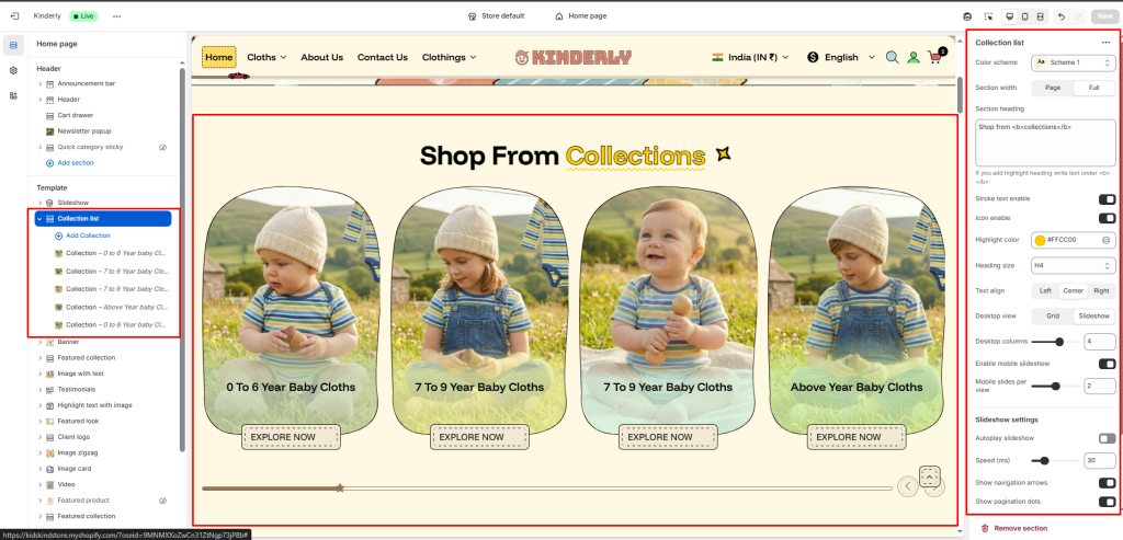
Block: Collection #
Each block represents one collection item in the slider or grid.
Collection #
Select the Shopify collection to be displayed.
Image #
Upload a custom image for this collection (recommended if you want a unique visual instead of the default collection image).
Collection title #
Enter a custom name for the collection display.
Collection URL #
Add the URL handle or custom link.


