This page will automatically list all the current collections in your store. By default, all collections will be listed alphabetically.
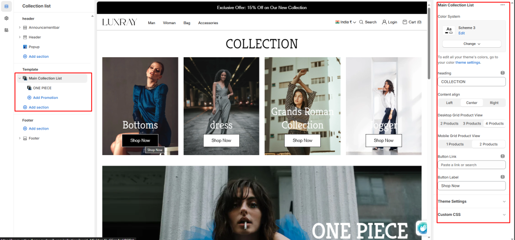
Main Collection List #
Color System: Select color system for background, text and button color.
Heading: Enter text to display as a heading.
Content align: Change text position left, center and right.
Desktop Grid Product View: Adjust the Products per row slider/grid to specify the number of products to display within each row inside the section. The minimum number is 2 products and the maximum is 5. This setting applies to desktop display devices.
Mobile Grid Product View: Use the Products per row on mobile radio buttons to specify the number of products to display in each row inside the section. The options are 1 and 2. This setting applies to mobile display devices.
Button label: Filling this in will display a button under the collection image.
Button link: Select links or collections/product for button.
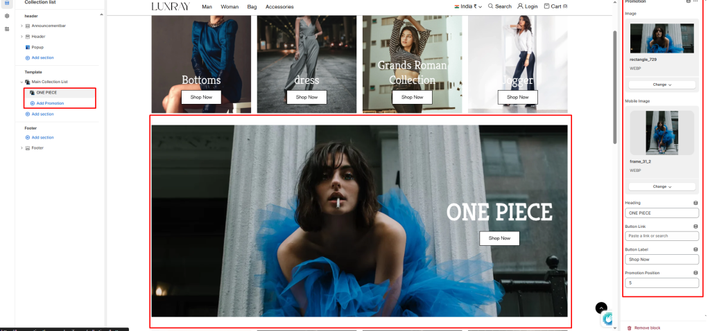
Block settings #
Desktop Image: Select an image to show in the desktop view.
Mobile Image: Select an image to show in the mobile view.
Heading: Enter text to display as a heading.
Button label: Filling this in will display a button under the image.
Button link: Select links or collections/product for button.
Promotion Position: Add number where you want to show promotion banner.