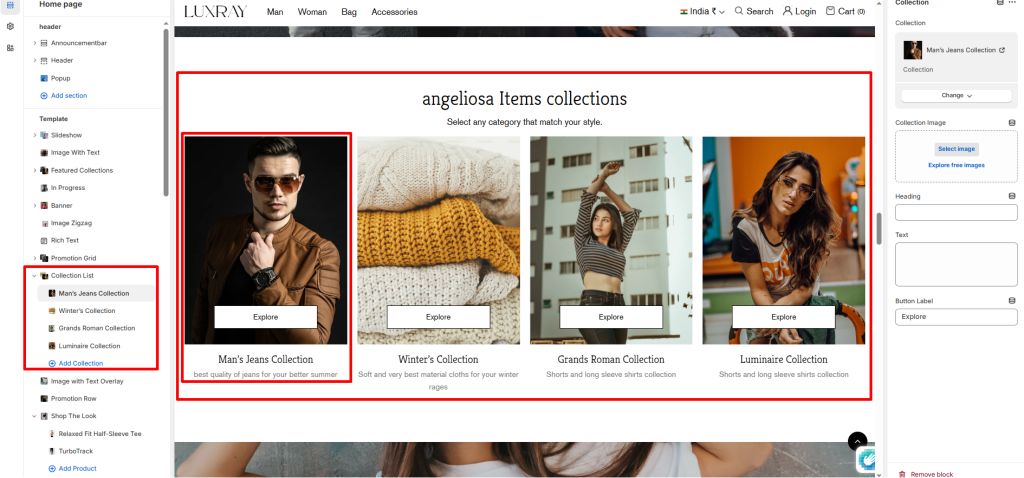
The Collection list section displays of all or selected collections.
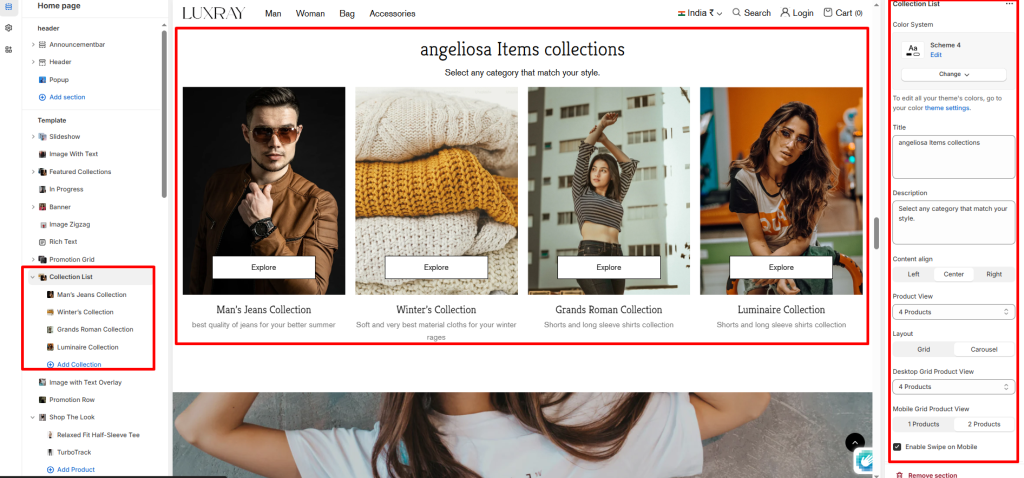
Color System: Select color system for background, text and button color.
Title: Enter text to display a section title above the section.
Description: Enter text to display a section description above the section.
Content align: You can set text align left, center and right.
Product View: The maximum number of collection limit.
Layout: Choose the layout that best suits your page’s design. There are two different modes to choose from for your store Grid/ Carousel.
Desktop Grid Product View: Adjust the Collection per row slider/grid to specify the number of collections to display within each row inside the section. The minimum number is 2 products and the maximum is 5. This setting applies to desktop display devices.
Mobile Grid Product View: Use the Collection per row on mobile radio buttons to specify the number of collections to display in each row inside the section. The options are 1 and 2. This setting applies to mobile display devices.
Enable Swipe on Mobile: Select/deselect to enable the Swipe on Mobile.
Block settings #
Collection: Select any collection to display in the list.
Collection Image: Option to select image or the collection image.
Heading: This will serve as the title of your collection.
Text: This will serve as the collection description of your collection.
Button Label: Add button label to redirect to collection page.