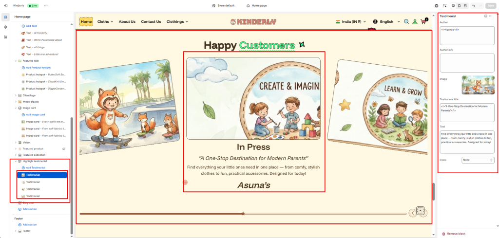
The Highlight Testimonial section displays customer testimonials in a large card slideshow format with an image, quote, author name, and supporting text — great for building social proof on the home page.
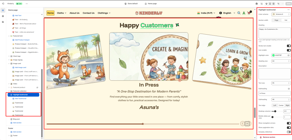
Color Scheme #
Choose a predefined color style from your theme’s color options.
Section Width #
Controls the layout width. Options: Page, Full.
Heading #
The main title for the section. Supports highlight text using <b> tag.
Stroke Text Enable #
Toggle to apply a stroke/outline effect on the heading. (Toggle)
Icon Enable #
Toggle to show a decorative icon next to the heading. (Toggle)
Highlight Color #
Pick the color used for the highlighted part of the heading.
Heading Size #
Select the heading tag size. Options: H1–H6.
Description #
Optional supporting text shown below the heading.
Text Size #
Adjusts the font size of the description.
Subheading #
A secondary label shown above or below the main heading.
Subheading Size #
Select the heading tag size for the subheading.
Text Align #
Aligns the heading content. Options: Left, Center, Right.
Desktop Columns #
Number of testimonial cards visible per view on desktop. Default: 2.5.
Mobile Slides per View #
Number of cards visible per slide on mobile.
Show Navigation Arrows #
Toggle to display previous/next arrows. (Toggle)
Show Pagination Dots #
Toggle to show dot indicators. (Toggle)
Autoplay Slideshow #
Toggle to enable automatic sliding. (Toggle)
Testimonial Block #
Each block adds one testimonial card. Click a block to configure:
Author #
The customer’s name. Supports italic styling using <i> tag.
Author Info #
Additional info about the author such as location or title.
Image #
Upload a lifestyle or product image for the testimonial card.
Testimonial Title #
A bold pull quote shown on the card.
Text #
The full testimonial body text.
Icons #
Select a decorative icon style to display on the card.