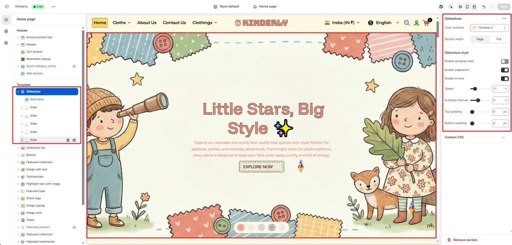
The Slideshow section displays a full-width hero banner with multiple slides, each supporting images, content blocks, and unique animation effects.
Color Scheme #
Choose a predefined color style from your theme’s color options.
Section Width #
Controls the layout width. Options: Page, Full.
Slideshow Style #
Enable Autoplay Slide #
Toggle to automatically advance slides. (Toggle)
Enable Pagination #
Toggle to show pagination dots below the slideshow. (Toggle)
Enable Arrows #
Toggle to display previous/next navigation arrows. (Toggle)
Speed (s) #
Sets the slide transition speed in seconds.
Autoplay Interval (s) #
Sets the time between automatic slide transitions.
Top Padding #
Sets vertical space above the section. Value in pixels.
Bottom Padding #
Sets vertical space below the section. Value in pixels.
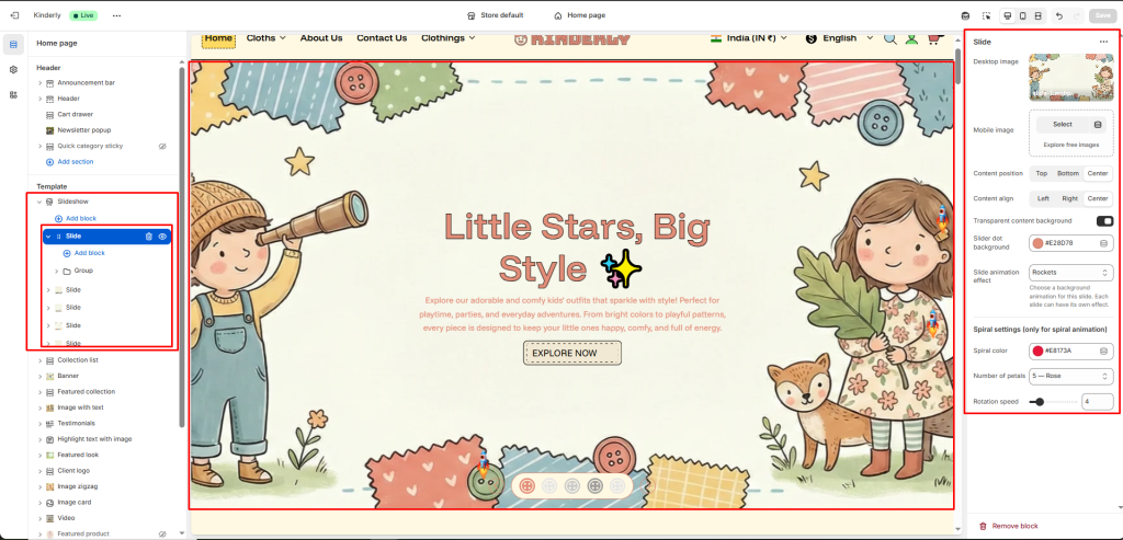
Slide Block #
Each block is one slide. Click a block to configure:
Desktop Image #
Upload the background image displayed on desktop.
Mobile Image #
Upload a separate background image optimized for mobile.
Content Position #
Sets the vertical position of the slide content. Options: Top, Bottom, Center.
Content Align #
Sets the horizontal alignment of the slide content. Options: Left, Right, Center.
Transparent Content Background #
Toggle to make the content area background transparent. (Toggle)
Slider Dot Background #
Sets the color of the pagination dot for this slide.
Slide Animation Effect #
Choose a background animation for this slide. Each slide can have its own effect.
Spiral Settings (only for spiral animation) #
Spiral Color #
Sets the color of the spiral animation.
Number of Petals #
Select the petal count/shape for the spiral.
Rotation Speed #
Sets how fast the spiral rotates.